
Good schedule magnet design balances readable information with enough space for the advertiser’s message. Size matters because schedules, logos, contact details, and marketing content all compete for limited space.
A design may look clear on a computer screen but become crowded at its final printed size. Therefore, buyers should consider more than price or the number of schedules included.
Why Does Magnet Size Affect Readability?
Every magnet has a fixed amount of usable space. As more information is added, type may become smaller and spacing may tighten.
However, a smaller magnet does not automatically mean poor readability. Careful design can organize a surprising amount of information within a compact format.
For example, a well-designed 6″ x 8″ magnet can display 16 football schedules while preserving dedicated advertising space at the top, as this image below shows:
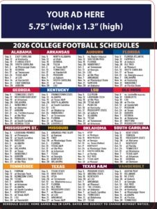
You can see additional multi-team examples on our NFL and college football schedule magnet layouts page.
Who Will Be Viewing the Schedule Magnet?
Magnet size should also reflect the people who will actually use it. Readability becomes especially important when an audience includes older adults.
Many people find very small print harder to read as they get older. Therefore, audience age can influence the best design choice.
A magnet intended for customers in their 50s, 60s, or older may benefit from larger type and more spacing.
The practical question is not simply how much information will fit. It is whether the intended audience can read it comfortably.
How Should You Balance Magnet Size, Advertising Space, and Cost?
A 6″ x 8″ magnet offers a compact format while still supporting a multi-team schedule. It also requires efficient use of advertising space.
An 8″ x 10.5″ magnet provides more physical display area and more room for the advertiser’s message. That space can support larger branding, additional services, or more prominent contact information, as this layout shows:
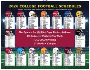
The difference resembles advertising in a newspaper or online publication. A larger advertising area provides more room for presentation and visual emphasis.
However, additional size may also affect production, shipping, or mailing costs. Therefore, the better choice depends on the advertiser’s priorities.
Why Should You Review a Magnet at Actual Printed Size?
An enlarged computer preview can make small lettering appear easier to read than it really is. Therefore, artwork should be reviewed at its actual printed size.
If possible, print a full-size proof before approving production. Then view it from approximately the distance customers will use it. If you cannot print it out, you can adjust a PDF design on your computer screen by setting the size to be 100%.
This simple test can reveal crowded schedules, weak spacing, or type that needs adjustment before printing begins.
What Makes an Effective Schedule Magnet Design?
The best schedule magnet is not automatically the largest or smallest option. Instead, it should fit the audience and marketing objective.
A smaller format may offer an efficient combination of schedules, advertising space, and cost. A larger format can provide greater visibility and more advertising room.
Most importantly, the finished magnet should remain useful. If recipients cannot comfortably read the schedule, much of its practical value disappears.
Effective schedule magnet design balances readability, advertising space, audience needs, and budget without making any one factor dominate the others.